
Red party cups are so familiar that most buyers stop seeing them. They turn up at tailgates, dorm kitchens, office birthdays and backyard barbecues, usually in the same saturated red, regardless of who manufactured them or what they cost.
That uniformity is not a matter of taste. Red earned its place through optical performance, manufacturing economics and decades of category habit. Understanding those forces tells you where a second color actually earns its shelf space — and where it only ties up working capital.
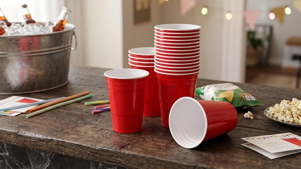
The Practical Case for Red
Red holds its color in poor light
Party environments are dim. String lights, a rented hall, a garage with one overhead bulb. In that setting, pale tints and whites tend to grey out, while saturated reds stay recognisable from across a room.
Red also separates cleanly from the surfaces a cup usually sits on — wood, white tablecloth, concrete, a person’s hand. That contrast is why it reads instantly as “this is my drink” in a crowd.
Opaque, saturated color hides what clear cups reveal
A red cup conceals scuffs from stacking, condensation rings, fingerprints and the residue left by dark drinks. Clear and white cups show all of it. For distributors, that difference shows up as fewer complaints per pallet and less shrink from damaged-looking stock in open cartons.
Deep pigmented cups also tend to mask variations in material input more forgivingly than light colors, which matters if you are sourcing cups with recycled content and want a consistent appearance batch to batch.
Red fits many occasions without naming one
Pink signals a baby shower. Green signals a holiday or an eco claim. Red carries celebration in a general sense — sports viewing, birthdays, national holidays, casual entertaining — across a wide range of markets.
That breadth is the commercial point. One SKU covers more events than a narrow occasion color, so a buyer can commit to fewer variants and still serve most of the demand they see.
There is a caveat worth raising with your supplier. Red is not a universally neutral signal: in some markets it reads as luck and celebration, in others it is tied to politics or mourning. If you export into mixed regions, confirm the destination market before standardising on it.
Print contrast is easy to work with
A white or metallic logo on red pops with a single print pass. Multi-color artwork on a pale cup often needs tighter registration and a second station, which adds cost per unit and slows changeovers.
For private-label programmes moving volume, that simplicity is often worth more than a more distinctive base color.
Matching Color to Occasion
Color choice is really occasion mapping. The table below is a working reference for distributors and event suppliers building a range.
| Color | Typical occasions | What to weigh before stocking |
|---|---|---|
| Red | Tailgates, casual parties, sports viewing, campus events | Broadest appeal and reorder rate; low print cost; weak fit for formal events |
| White | Catering, corporate functions, weddings | Reads clean and neutral; shows scuffs and condensation; low contrast for pale drinks |
| Clear / translucent | Outdoor events, iced coffee, juice, craft beverage service | Shows the product; needs higher-clarity resin; surface marks are visible |
| Black | Hospitality, spirits service, premium corporate | Premium cue, hides scratches; can feel heavy at daytime family events |
| Pastel (pink, mint, lilac) | Baby showers, weddings, seasonal promotions | Strong occasion pull but short demand windows; plan inventory tightly |
| Blue / green | Children’s parties, team events, eco-positioned lines | Team and brand matching; a green cup only reads “eco” if the material claim backs it |
Two observations from that table tend to matter more than the colors themselves.
First, occasion colors sell in bursts. Pastels and seasonal shades are ordered against a date, which means leftovers become next year’s dead stock. Red, white and clear absorb demand across the calendar and are safer to hold in depth.
Second, the cup color has to agree with the rest of the table setting. Range planning should follow your customer list, not the color wheel.
Where Red Stops Working
Red is a poor default in three situations, and buyers should be able to name them.
Formal catering is the clearest one. At weddings and seated dinners, red reads loud and casual; white, clear or a muted tone carries the setting better.
Branded corporate work is the second. If the client’s identity is navy or sage, a red cup fights the print instead of supporting it. Brand-matched cups usually justify the higher minimum order.
Premium beverage service is the third. An opaque red cup hides the drink, and for iced coffee, cocktails or fresh juice the product is the selling point. That is precisely where translucent formats have been gaining ground.
Color Trends Worth Tracking
Translucent and crystal finishes
Frosted, tinted translucent cups — the softer “crystal” look rather than plain clear — have moved from specialty coffee into general event supply. The appeal is straightforward: the drink stays visible, the cup photographs well, and a light tint feels more considered than either clear or solid.
The technical trade-off is real. Tinted translucency demands higher-clarity resin and tighter process control; poorly dispersed pigment turns a soft tint muddy, and a translucent wall shows scuffs that an opaque one absorbs. Expect a narrower color tolerance and a higher unit cost than standard opaque lines.
Low-saturation, hospitality-driven palettes
Sage, terracotta, dusty pink and warm sand have spread from interior and event design into disposable tableware. These shades sell to planners and venues rather than to shoppers buying a single pack, so expect smaller runs, more colour references and more sample requests.
Color as a brand asset rather than a stock option
More buyers now treat cup color as part of the brand system instead of picking from a catalogue. That shift changes procurement: you are no longer comparing price per carton alone, but colour-matching capability, minimum order quantity, and how reliably a shade repeats across reorders six months apart.
FAQ
Is red genuinely the best-selling party cup color, or is that just an assumption?
Yes, in most Western retail and event-supply markets red is the highest-volume single color, but the reason is cumulative rather than inherent. It is the color buyers reorder, the one event planners specify by habit, and the one that photographs as “a party.” Treat it as a reliable base SKU, not as proof that red outperforms on every occasion.
How many colors should a distributor carry?
Start with three: red as the volume base, white or clear for catering and beverage service, and one accent shade matched to your largest seasonal account. Adding a fourth color before the third turns over simply splits the same demand across more SKUs and raises your slow-moving inventory.
Do translucent cups cost more than opaque ones?
Typically yes. Tinted translucent formats need higher-clarity resin, tighter colour control and more careful handling to avoid visible surface marks, all of which raise unit cost. The premium is usually justified only where the drink itself is the selling point.
How do you keep color supply stable across repeat orders?
Stability comes from pigment discipline, not luck. Ask for a retained colour standard from the first production run, have each batch checked against it, and confirm which base resin the shade was matched on. Reliancepak holds colour standards against approved masterbatch and runs multiple production lines, which is how repeat orders for distributors and food-service accounts stay visually consistent between shipments.
Can we order a custom cup color, and what does the process involve?
Yes, and for B2B volumes it is usually the better route. The sequence is: send a physical colour reference or Pantone number, approve a sample cup produced on the actual line, then lock the colour standard before mass production. Custom OEM and ODM work of this kind is standard at Reliancepak, with free samples available before you commit to a run.